
Have you ever struggled to show how multiple factors contribute to a final result in your data presentations? Waterfall charts solve this common visualization problem. They elegantly display the positive and negative changes that lead to an end value.
- What is a Waterfall Chart and Why It Matters
- Understanding The Structure Of Waterfall Graphs
- How Waterfall Charts Differ From Bar And Line Charts
- Common Use Cases Across Industries
- When to Use Waterfall Charts for Maximum Impact
- Ideal Scenarios For Waterfall Analysis
- Examples From Finance, HR, And Operations
- Limitations And When To Avoid Them
- Building Advanced Waterfall Charts Step-by-Step
- Preparing Your Data For Waterfall Charting
- Creating Waterfall Charts In Excel
- Using Waterfall Charts In Power BI
- Handling Negative Values And Subtotals
- Designing for Clarity: Best Practices and Pitfalls
- Choosing The Right Colors And Labels
- Avoiding Clutter And Over-Segmentation
- Optimizing Axis Scaling And Layout
- Telling Better Stories with Waterfall Charts
- Crafting A Narrative With Sequential Data
- Highlighting Key Drivers And Turning Points
- Combining Waterfall Charts With Other Visuals
- Conclusion
McKinsey & Company popularized these dynamic visualizations in the 1980s, and they have become vital tools for telling data stories. A waterfall chart is a specialized bar chart that shows how an original value changes through several intermediate steps to reach a final value.
These graphs excel at highlighting your data’s progression, which makes them perfect for analysis when understanding the path matters as much as the destination.
Simple pie or line charts sometimes fall short of what you need. Waterfall charts fill this gap by combining elements of both to show composition and change at once. They answer vital questions like “What drove this change?” and “Which elements helped or hurt our performance?”.
Project managers, financial analysts, and product teams find these charts valuable for tracking performance.
We’ll explore when to use them and how to design them for maximum clarity. Soon you’ll craft waterfall chart examples that turn complex data into clear, compelling stories.
What is a Waterfall Chart and Why It Matters
Waterfall charts tell stories through data by showing how positive and negative values add up over time. These visualizations connect data points to paint a complete picture of value changes across time periods or categories.
Understanding The Structure Of Waterfall Graphs
Waterfall graphs stand out with their floating bars that create a cascading effect. People often call them “flying bricks charts,” “Mario charts” (they look like floating bricks in Nintendo games), or “bridge charts”.
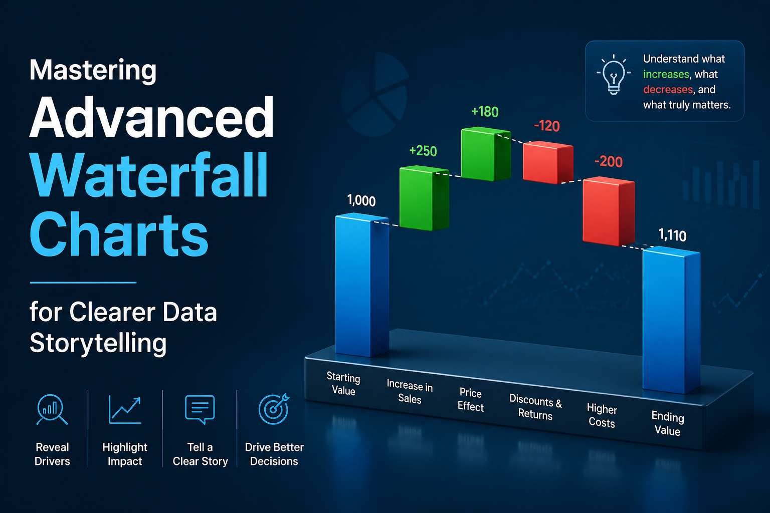
A waterfall chart has three essential parts:
- Starting value bar – The baseline that kicks everything off, marked by its own color
- Intermediate bars – These show increases (positive values) or decreases (negative values) that change the original value, looking like they float in space
- Final result bar – The end point that reveals the total after all changes
Each bar builds on the previous one’s endpoint. Colors play a crucial role; usually, green or blue shows increases while red indicates decreases. Readers can spot positive and negative changes right away thanks to this simple design.
How Waterfall Charts Differ From Bar And Line Charts
Regular bar charts need all bars to start from zero, but waterfall charts play by different rules. The first and last bars must touch the baseline, while everything between floats based on running totals.
Waterfall charts blend the best features of other chart types. They show parts-to-whole relationships like pie charts and track changes like line charts. This creates something special, a view that captures both composition and step-by-step changes.
Line charts do great with trends, but can’t show individual contributions well. Bar charts compare categories but miss sequential connections. Waterfall charts bridge this gap by revealing how each piece builds toward the final picture.
Common Use Cases Across Industries
Financial teams love waterfall charts. They use them to show:
- Profit and loss statements
- Budget variance analysis
- Cash flow analysis
- Revenue and expense breakdowns
HR teams track staff changes, showing year-start numbers, new hires, moves, departures, and final counts. Marketing teams analyze campaign results and conversion funnels. Operations teams use them to study inventory and supply chains.
Project managers rely on these charts to track resources and costs. Sales teams analyze customer gains versus losses.
Waterfall charts work anywhere you need to show step-by-step changes. You can see great examples at zebrabi.com.
The charts really shine when telling stories about change. They break complex shifts into bite-sized pieces while keeping the big picture clear. The design flows naturally from left to right, and colors instantly show whether changes help or hurt.
When to Use Waterfall Charts for Maximum Impact
The right timing for waterfall charts can make your data presentation either shine or fall flat. These visual tools really stand out when you need to tell the story behind changes rather than just showing final numbers.
Ideal Scenarios For Waterfall Analysis
Waterfall charts excel at answering questions like “What drove this change?” or “Which elements helped, and which ones pulled us down?” They give quick visual insights that highlight the path between two values in a way that tables just can’t match.
The best use case shows incremental contributions to a total, especially when you have both positive and negative factors affecting the outcome.
The sort of thing I love about these charts shows up when:
- You need a breakdown of income flow by periods or categories
- You want to see the budget differences between plans and results
- You must show beginning and ending totals with their contributing factors
Waterfall charts turn complex financial data into easy-to-grasp visuals. Teams can spot key insights quickly instead of digging through raw data. Executives love them in boardroom presentations because they get clear answers without drowning in spreadsheets.
Examples From Finance, HR, And Operations
Financial analysis remains the most common application. Waterfall charts show profit and loss statements, budget variances, and revenue bridges. CFOs make use of them to demonstrate how revenue becomes net income by showing each deduction step.
HR teams track workforce changes with these visuals effectively. The year starts with January 1 headcount, adds new hires as positive bars, shows departures as negative bars, and ends with December 31 numbers. This method reveals whether growth comes from more hiring or better retention.
Supply chain leaders audit stock levels through waterfall charts. They start with opening inventory, add what’s produced or bought, and subtract sales and losses to show closing stock. Sales teams look at their pipeline the same way, beginning with quarterly values, adding opportunities, and subtracting closed or lost deals.
Project budgets and production metrics become clearer to operations teams through these charts.
Limitations And When To Avoid Them
Waterfall charts have their drawbacks. Here are key constraints to think about:
- Complexity overload: Charts with more than 15 variables become hard to read. A simple table works better.
- Comparison challenges: Multiple sequences don’t work well. Five competitors shown side-by-side create chaos.
- No common baseline: Accurate segment comparisons need a consistent baseline.
- Large value disparities: Tiny intermediate changes get lost between big starting and ending values.
- Volatility masking: Net changes appear clearly but hide ups and downs during the period.
Detailed analysis needs more than waterfall charts since you can’t select or expand the data. Line or bar charts work better for interactive exploration or trend analysis.
Note that audiences unfamiliar with waterfall visualization need a quick explanation, or you might want to use a more common chart type.
Building Advanced Waterfall Charts Step-by-Step
Creating impressive waterfall charts needs careful data preparation and the right technical approach. Let’s tuck into the step-by-step process that makes these valuable visualizations come alive.
Preparing Your Data For Waterfall Charting
A strong baseline anchors every effective waterfall chart. Your information should have categories in one column with corresponding values in another. The data needs a starting value, all contributing changes, and the ending total.
Financial statements typically include:
- Starting value (like net income or beginning balance)
- Sequential positive and negative changes
- Subtotals where appropriate
- Final ending value
Complex datasets become clearer when you group related items into logical categories. This helps your audience learn the story behind the numbers.
Creating Waterfall Charts In Excel
Excel’s built-in functionality creates waterfall charts through a straightforward process:
- Select your prepared data range
- The Insert tab contains the Charts menu
- The Waterfall chart type appears near the bottom of the options
Your chart needs designated totals after creation:
- A single click selects the data series
- Another click focuses on the specific column
- The ‘Series Options’ contains the ‘Set as total’ checkbox
The visualization becomes clearer without gridlines and legends. Excel lets you break the axis to highlight smaller contributions when needed.
Using Waterfall Charts In Power BI
Power BI makes waterfall chart creation simple:
- The Data pane holds your measure (like Total Sales)
- The Waterfall chart icon sits in the Visualizations pane
- Your category field (like Month or Territory) completes the setup
Power BI’s waterfall charts feature breakdown analysis. This powerful tool splits each data point into segments that show contribution patterns. The Maximum breakdowns setting controls the visible segments.
Handling Negative Values And Subtotals
Colors distinguish between increases and decreases in waterfall charts. Subtotals like quarterly results need anchoring to the baseline:
- Right-click brings up the data point menu
- Set as Total anchors the value
- Power BI users follow similar steps with a right-click on the column
Charts automatically extend below the x-axis for negative values. Some tools let you customize negative label appearance with format strings like 0;0; to show negative values as positive.
Designing for Clarity: Best Practices and Pitfalls
A waterfall chart needs good design to work. Your audience’s understanding of the data story depends on how visually appealing your charts look.
Choosing The Right Colors And Labels
Colors do more than just decorate; they serve a purpose. The right color coding lets viewers learn the meaning of each element quickly:
- Start and end totals: Use neutral or dark shades like gray or navy blue
- Positive changes: Apply colors associated with increases (typically green or blue)
- Negative changes: Use colors for decreases (traditionally red or orange)
Blue for positive and orange for negative values works better than the standard green/red combination to help color-blind users.
Great waterfall charts need proper labels. Your audience should understand each element right away. Numbers work best when placed directly on or above bars because viewers shouldn’t have to look back at the y-axis. The x-axis needs clear, readable category labels to keep the focus on your data story.
Avoiding Clutter And Over-Segmentation
A waterfall chart becomes hard to read when it has too many columns; it looks like a jagged staircase. Keep your chart to 10-15 columns at most. Group smaller items into an “Other” category when you have many minor contributors.
Here’s a simple rule: skip anything that doesn’t add value. A clean chart that focuses on key points works better than one stuffed with every small change. Your audience wants to see the main drivers, not a complete list of tiny variations.
Optimizing Axis Scaling And Layout
Most charts should start at zero, but waterfall charts can be different. Small changes become almost invisible with a zero baseline when your starting value is huge (like 1,000,000).
You can break the axis in these cases, just make sure to label it clearly. The goal is to show meaningful changes, not mislead anyone.
A few thoughtful additions can lift your waterfall visualization. Write titles that highlight key findings. Use white space to reduce clutter and add reference lines or standards for context.
Note that your waterfall chart should tell its story quickly, letting viewers spot insights in seconds.
Telling Better Stories with Waterfall Charts
Data storytelling makes great analysts stand out from good ones. Waterfall charts transform complex numerical relationships into compelling narratives that guide viewers through your data experience.
Crafting A Narrative With Sequential Data
Waterfall charts guide the audience from left to right, just like a good story. Subtotal columns work as visual checkpoints that break complex information into digestible pieces, similar to chapters in a book. Each bar tells a part of your data story; some show victories (positive values), others reveal challenges (negative values).
The magic happens in the sequential flow. Waterfall charts show how individual components add up to the final total, creating a clarity that tables or standard charts can’t deliver.
Highlighting Key Drivers And Turning Points
Great waterfall charts spotlight what drives change. You can arrange increases and decreases by size when categories don’t have a natural sequence. This setup draws immediate attention to your most important contributors.
Those subtle moves between segments often reveal critical turning points in your data story. These moments, where values change direction dramatically, usually hold valuable insights that decision-makers need.
Combining Waterfall Charts With Other Visuals
Power BI doesn’t directly support combining waterfall graphs with line charts, but solutions exist. You can use transparent backgrounds and overlap visuals. Another option is to create dashboards with complementary charts that tell different parts of the same story.
Conclusion
Waterfall charts are great tools to tell visual data stories. In this piece, we explore how these charts show positive and negative changes that lead to a final result. Their cascading structure helps display your data’s experience, not just the result.
These charts work best when you break down complex changes into understandable segments. Financial analysis is their most common use, and they work just as well in HR, operations, and sales contexts. Notwithstanding that, they don’t fit every situation. They become hard to read with too many variables or large value differences.
You just need careful data preparation to create effective waterfall charts. Excel and Power BI provide simple tools to create these visualizations. Each platform has its own way to handle subtotals and negative values. The right setup turns confusing numbers into clear visual stories.
Color is a vital part of making waterfall charts work. Smart color coding helps your audience quickly understand increases and decreases. It also helps when you use thoughtful labeling and proper axis scaling to prevent confusion and highlight important data points.
Waterfall charts are storytellers at heart. They guide viewers through data like chapters in a book and reveal key turning points and change drivers. You can create a more effective visualization by combining them with other visualizations in dashboards.
With what you learn from this piece, you’ll create waterfall charts that turn complex data into clear, compelling stories your audience can understand quickly. Happy charting!