
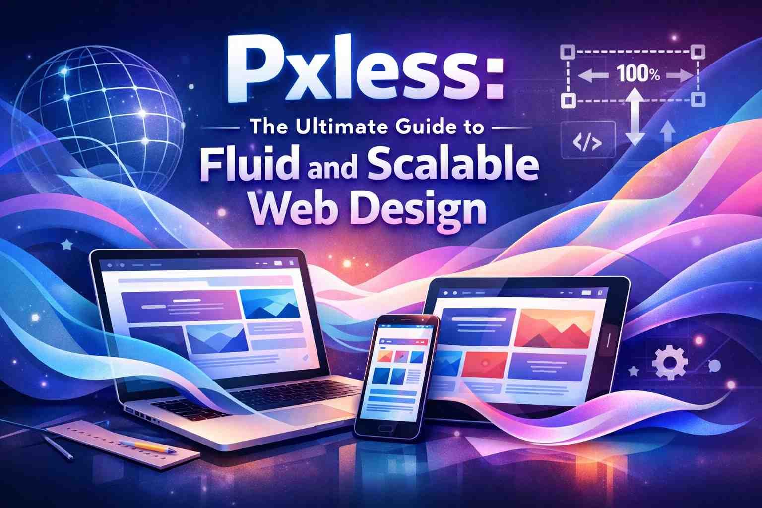
You open a website on your phone. The text is tiny, elements overlap, and you zoom in twice just to read a paragraph. The designer probably built it on a 1920px desktop monitor and never tested anything else. That is the core problem pxless solves.
- What Is Pxless? Meaning and Core Concept
- How Pxless Evolved: From Responsive Design to Pixel-Free Philosophy
- Why Pxless Matters in Modern Web Development
- Core Principles of Pxless Design
- Relative Units Over Fixed Pixels
- Fluid Grids and Flexible Layouts
- Fluid Typography and Spacing
- Design Systems and Tokens
- Pxless vs. Traditional Pixel-Based Design
- Pxless and Performance Optimization
- Pxless and Accessibility
- Pxless and SEO Compatibility
- Pxless in Content-Centric Design
- Real-World Applications of Pxless
- Real-World Examples of Pxless in Action
- How to Implement Pxless: Step-by-Step Guide
- Conducting a Pxless Audit
- Building a Pxless Foundation
- Fluid Typography Implementation
- Scalable Images and Media
- Testing and Refining
- Best Practices for Pxless Implementation
- Overcoming Challenges in Pxless Design
- Pxless and Developer-Designer Collaboration
- Pxless and User Trust, Branding, and Visual Aesthetics
- Pxless as a Competitive Advantage and Long-Term Investment
- Future Trends in Pxless Design
- Measuring Pxless Success
- Conclusion
- FAQs
Pxless is not a framework or a tool you install. It is a design approach that removes dependence on fixed pixel values and replaces them with units that scale naturally across every screen. Designers and developers who adopt this philosophy stop building for one perfect screen and start building for all of them.
What Is Pxless? Meaning and Core Concept
The word combines “px” — the CSS shorthand for pixel — and “less.” Together, they describe a mindset shift in digital design.
Traditional design relied on exact pixel values. A heading might be set at 48px, a container locked at 1200px wide, and margins fixed at 24px on every side. That works fine when everyone views the same screen. But today, the same content loads on a 6-inch phone, a tablet, a laptop, a 32-inch monitor, and even a wearable. Fixed pixels break under that pressure.
Pxless design replaces static pixel units with relative units:
- rem/em — scale based on font size settings
- % (percentages) — scale relative to the parent container
- vw / vh — scale based on viewport width and height
- clamp() — sets a flexible range between min and max values
The result is an interface that adapts naturally. Content stays readable. Layouts hold their visual harmony without manual overrides for every screen size. In essence, pxless is a device-agnostic design built on proportional relationships rather than rigid measurements.
How Pxless Evolved: From Responsive Design to Pixel-Free Philosophy
Responsive web design was the first major step. When Ethan Marcotte introduced it in 2010, the web started moving from fixed layouts to fluid grids. But even those early responsive designs still leaned on pixel-based breakpoints — 320px for mobile, 768px for tablet, 1024px for desktop.
The problem? Every time a new screen size appeared, developers added another breakpoint.
CSS evolved to address this. Flexbox arrived and handled single-axis layouts automatically. Grid handled two-dimensional layouts without fixed containers. Then came container queries, which let components respond to their parent element’s space rather than the full viewport.
Fluid typography followed. Instead of writing separate font-size rules for each breakpoint, developers used clamp() to define a smooth range. A heading could scale from 24px on mobile to 48px on a large monitor with a single line of CSS.
Pxless represents where all of these improvements converge — a web that flows naturally without snapping through rigid breakpoint stages.
Why Pxless Matters in Modern Web Development
Device diversity is no longer an edge case. Users access content from phones, tablets, laptops, smart TVs, foldables, and AR/VR displays. The range of screen resolutions in active use today spans thousands of unique sizes.
Fixed pixel layouts were built for a narrower era. When a layout breaks on a 390px phone screen or overflows on an ultra-wide monitor, users leave. That directly affects engagement time, conversion rates, and search rankings.
Pxless addresses each of these pressure points:
| Problem | Pxless Solution |
| Layout breaks on small screens | Fluid grids adapt to any container width |
| Text too small on mobile | Scalable rem/em units respect user font settings |
| Heavy CSS with too many overrides | Relative units reduce media query complexity |
| New devices require redesigns | Flexible systems adapt automatically |
| Accessibility Zoom breaks the layout | Scalable units maintain proportional structure |
In practice, teams that shift to flexible systems report fewer bug reports around layout issues and spend significantly less time writing device-specific CSS overrides.
Core Principles of Pxless Design
Relative Units Over Fixed Pixels
Instead of thinking “this button is 200px wide,” think “this button takes 50% of its container.” Relative units — rem, em, vw, vh, and percentages — adjust automatically based on the screen size or user settings.
Rem is particularly useful for typography. Set a base font size on the root element, and every rem value scales proportionally. Users who increase their device font size for readability still get a functional layout rather than broken text.
Fluid Grids and Flexible Layouts
CSS Grid and Flexbox are the backbone of fluid layouts. With functions like minmax() and auto-fit, a grid reorganizes itself without a single pixel-locked breakpoint. Elements expand into available space and contract when space is limited.
A common issue is over-relying on fixed container widths like 1200px. Replacing that with a percentage or viewport-based width immediately makes the layout responsive to the full device range.
Fluid Typography and Spacing
The clamp() function gives typography a minimum, a preferred value, and a maximum. A headline might range from 22px on a small phone to 52px on a large desktop — all handled by a single CSS rule with no breakpoints.
This approach also applies to spacing. Margins and padding defined with em units scale alongside the text they surround, keeping proportions consistent regardless of screen size.
Design Systems and Tokens
Pxless works best when spacing, color, and typography values live as design tokens — reusable variables that define the entire visual system. Instead of hardcoding 16px padding in fifty different components, a token called –spacing-md holds that value once.
When you need to scale the system, you update one token. Every component updates automatically. This is where pxless and systematic design reinforce each other most clearly.
Pxless vs. Traditional Pixel-Based Design
| Aspect | Pixel-Based | Pxless |
| Units | Fixed px values | rem, em, %, vw, vh |
| Responsiveness | Manual breakpoints | Naturally fluid |
| Accessibility | Breaks at Zoom or large text | Scales with user settings |
| Maintenance | Per-device CSS overrides | Flexible by default |
| Future-proofing | Limited | Adapts to new devices automatically |
Pixel-based design offers a false sense of precision. The layout looks exactly right in your browser at one specific resolution. But for the user on a different device, that precision disappears.
Pxless and Performance Optimization
Fluid layouts reduce CSS complexity. Fewer media queries mean smaller stylesheets. Browsers perform fewer layout recalculations when elements scale proportionally instead of snapping between fixed states.
Faster load times improve user retention and send positive signals to search engines. Page speed is a confirmed ranking factor, and removing unnecessary CSS overrides directly contributes to rendering efficiency.
Lightweight frameworks that embrace relative units also compress better and parse faster. The performance benefits are not dramatic in isolation, but they compound with accessibility and UX improvements into measurable SEO gains.
Pxless and Accessibility
Accessibility is where pxless delivers some of its clearest real-world value. Many users — particularly those with visual impairments — increase their browser or device font size. Layouts built on fixed pixels often collapse or overflow when this happens.
Scalable units respect those preferences. When a user sets their base font to 20px, rem-based text scales up proportionally. Spacing scales with it. The layout stays functional.
Pxless also helps users who use Zoom. Instead of triggering horizontal scrolling or broken component states, a fluid layout redistributes content within the available space. This directly supports WCAG accessibility standards and improves Lighthouse accessibility scores.
In most cases, teams that adopt pxless report accessibility improvements without additional development effort — it is a natural outcome of building with scalable units.
Pxless and SEO Compatibility
Search engines evaluate user experience signals. Mobile friendliness, bounce rates, and readability all feed into how a site ranks. A layout that breaks on mobile sends users back to the search results almost immediately.
Pxless design improves mobile friendliness structurally. Because layouts adapt to any screen without separate mobile versions, there are fewer indexing inconsistencies between desktop and mobile content. Maintenance is simpler, reducing the risk of technical errors that could affect crawling.
Behavioral signals — how long users stay, whether they scroll, whether they convert — improve when content is readable and usable across devices. Pxless creates those conditions by default.
Pxless in Content-Centric Design
Content should drive layout decisions, not the other way around. Fixed pixel containers often force content into boxes that do not fit its natural structure. Long headlines are truncated. Images stretch. Paragraphs feel cramped.
Pxless inverts this relationship. Typography scales to remain readable. Spacing adjusts to give content room. Layouts flow around the message rather than constraining it.
This matters for both user comprehension and search visibility. Well-structured, readable content performs better in both dimensions.
Real-World Applications of Pxless
Web and Digital Platforms
E-commerce platforms were among the first to benefit visibly. Product grids that reflow across screen sizes without manual breakpoints reduce development overhead significantly. SaaS dashboards built on flexible systems adapt to different viewport sizes used by their users — from desktop power users to tablet-first workflows.
Mobile applications follow the same logic. Responsive layouts built with relative units handle the range of Android and iOS screen sizes without device-specific code paths.
Branding and Visual Identity
Logos and icons built as SVGs scale infinitely without quality loss. Typography defined with scalable tokens maintains brand consistency across social media, web, and digital advertisements. Corporate websites that embrace pxless principles look intentional and polished across every context.
Augmented and virtual reality interfaces are beginning to adopt the same philosophy. In those environments, there is no fixed screen size at all — adaptability is the only viable approach.
Large-Format and Print Design
This is where pxless thinking extends beyond the browser. In the printing industry, particularly for large-format work like banners and billboards, designs built with vector-based graphics and proportional systems translate far more cleanly to physical output.
Using vw and vh units during the digital design phase gives a reliable sense of how elements will scale to a printed format. SVG assets maintain fidelity at any physical size, avoiding the pixelation issues that affect raster images like PNGs and JPEGs.
Real-World Examples of Pxless in Action
Several major platforms already apply pxless principles without labeling it that way.
Figma uses auto-layout and responsive resizing so that components adapt based on their content rather than fixed dimensions. Designers define relationships, not measurements.
Google’s Material Design 3 relies on dynamic color, fluid grids, and responsive type scaling — all core pxless concepts applied at a massive scale across Android and the web.
Apple’s Human Interface Guidelines for iOS and macOS emphasize adaptable spacing and scalable type systems. The guidance explicitly moves away from pixel rigidity toward flexible, device-agnostic layouts.
These are not experiments. They are the standard design systems for the world’s largest digital ecosystems.
How to Implement Pxless: Step-by-Step Guide
Conducting a Pxless Audit
Start by identifying where fixed pixel values dominate your current system. Look at font sizes, padding, margins, container widths, and breakpoints. This pxless audit shows you exactly where flexibility is missing and where relative units can replace hardcoded values without breaking the layout structure.
Building a Pxless Foundation
Define design tokens for spacing, typography, and color before writing any component-level CSS. Use relative units or ratios as the stored values. Apply CSS Grid and Flexbox to replace fixed containers. A token-driven foundation means future changes propagate automatically.
Fluid Typography Implementation
Set a root font size on the HTML element. Use rem for all text elements so they scale from that root. For headings and display text, apply clamp() to define a smooth range between minimum and maximum sizes. This eliminates separate font-size declarations for every breakpoint.
Scalable Images and Media
Set images to max-width: 100% so they never overflow their container. Replace raster image formats with SVG wherever possible — logos, icons, and illustrations all benefit from infinite scalability. For images that require different resolutions on different devices, use the srcset attribute in HTML to serve appropriately sized files.
Testing and Refining
Use Chrome DevTools to test across emulated device sizes. Resize the browser window manually to catch layout issues at unusual dimensions. For large-format print projects, produce a physical sample before finalizing. Test on real devices when possible — emulation captures most issues, but not all.
Best Practices for Pxless Implementation
- Think in ratios and proportions, not fixed numbers
- Build mobile-first — expand outward rather than scaling down
- Use container queries instead of viewport breakpoints where components need context-aware behavior
- Apply CSS variables for all spacing and typography tokens
- Use Figma’s auto-layout for design components that translate cleanly to flexible code
- Keep your codebase clean — fluid containers and edge-case handling are easier to maintain than stacked overrides
Overcoming Challenges in Pxless Design
The most common barrier is not technical — it is psychological. Designers trained on pixel-perfect workflows find relative units unpredictable at first. The key is to stop trying to control exact dimensions and focus on defining proportional relationships instead.
Consistency across devices requires testing rather than assumption. Use clamp() to cap fluid values at sensible minimums and maximums. Fluid grids with minmax() prevent elements from shrinking or stretching beyond usable limits.
A common issue is stakeholder resistance. Some clients still expect pixel-identical designs across every device. The most effective response is a side-by-side comparison of load performance, accessibility scores, and user engagement data before and after a pxless implementation.
Document your spacing conventions, scaling logic, and typography system clearly. When designers and developers share the same reference, inconsistencies drop significantly.
Pxless and Developer-Designer Collaboration
Fixed pixel specs create a gap between design and development. Developers translate exact values into code, then discover they break at half the device sizes in use. This creates rework cycles that slow projects down.
Pxless closes that gap. When both disciplines work from the same flexible system — shared design tokens, documented spacing relationships, and component behavior guidelines — implementation becomes more predictable. Developers spend time on functionality rather than layout corrections. Project timelines shorten as a direct result.
Pxless and User Trust, Branding, and Visual Aesthetics
A design that behaves consistently builds credibility. When users encounter the same clean layout whether they open a site on their phone during a commute or on a desktop at their desk, they trust the product more. That trust translates into repeat visits, lower bounce rates, and stronger conversion rates.
Pxless does not limit visual creativity. Dynamic layouts that respond to context often feel more considered than static pixel arrangements. Visual balance that comes from proportional systems reads as intentional and polished rather than mechanical.
Modern aesthetics favor clarity and elegance — qualities that fluid design supports naturally.
Pxless as a Competitive Advantage and Long-Term Investment
Organizations that adopt pxless early reduce long-term technical debt. Each new device generation does not require a separate redesign cycle. Layout logic built on relative units holds up across changing technology without accumulating layers of device-specific overrides.
The competitive edge is real. A site that loads faster, scores higher on accessibility audits, and performs better in mobile rankings outperforms competitors that still maintain separate mobile stylesheets or ignore accessibility entirely.
Over a project’s lifespan, pxless significantly reduces maintenance resource requirements. Updates propagate through design tokens rather than requiring manual changes across every component.
Future Trends in Pxless Design
Container queries are already changing how components respond to their environment. Instead of reacting to the viewport, components react to their parent — giving granular layout control without reverting to pixel breakpoints.
Variable fonts are expanding typographic flexibility further. A single font file can adjust weight, width, and size dynamically, supporting pxless typography without multiple static assets.
AI-powered design tools are beginning to automate spacing and layout decisions. Pxless architecture — built on tokens and relative relationships — provides the structured foundation these tools need to generate consistent, scalable output.
Foldable screens, wearables, and immersive AR interfaces are making adaptability the only viable design standard. Pxless is not ahead of its time. It is precisely on time.
Measuring Pxless Success
Track these metrics before and after implementation:
| Metric | What It Shows |
| Page load time | Reduced CSS weight and fewer recalculations |
| Bounce rate | Improved layout usability across devices |
| Lighthouse accessibility score | Scalable units supporting user preferences |
| Device testing pass rate | Layout stability across screen sizes |
| SEO ranking (mobile) | Mobile-friendliness and performance signals |
UX metrics tell the fuller story. Engagement time, scroll depth, and conversion rate all reflect whether users find content readable and functional — the direct outcomes of a well-executed pxless system.
Conclusion
Pixel-based design made sense when screens were predictable. That era is long over. Today’s users bring every possible screen size, resolution, and accessibility need to every interaction.
Pxless design meets that reality with a structural solution. By replacing fixed pixel values with relative units, fluid grids, scalable typography, and design tokens, interfaces adapt to any environment without constant maintenance. The result is stronger SEO, better accessibility, faster performance, and longer-term relevance.
Adopting pxless is not a redesign project — it is a shift in how design decisions get made. Start with a pxless audit, establish a token-based foundation, and build from proportions rather than pixels. Every component you convert moves your product closer to a system that scales with technology rather than against it.
FAQs
What is the main goal of pxless?
The goal is to create scalable digital experiences that adapt naturally to any device without relying on fixed pixel values. Instead of designing for one screen, pxless designs work across all of them through proportional, flexible systems.
Is pxless suitable for all types of websites?
Most modern websites benefit from pxless principles, particularly those focused on content, performance, and mobile-first user experience. E-commerce platforms, SaaS dashboards, editorial sites, and corporate web properties all see measurable improvements in usability and maintenance overhead.
Does pxless improve SEO rankings?
Directly, pxless improves mobile friendliness and page performance — both confirmed ranking factors. Indirectly, it improves engagement metrics like bounce rate and session duration, which search engines treat as signals of content value and usability.
Is pxless difficult to implement?
The technical side is straightforward for anyone comfortable with modern CSS. The harder shift is moving away from pixel-perfect thinking. Once you start working in ratios, tokens, and proportional relationships, the approach becomes more intuitive than managing dozens of fixed breakpoints.
Can pxless work with existing design systems?
Yes. The transition does not require rebuilding everything at once. Start by replacing the most common fixed values — base font sizes, container widths, padding — with relative units and design tokens. Existing systems absorb these changes incrementally without requiring complete redesigns.